Context
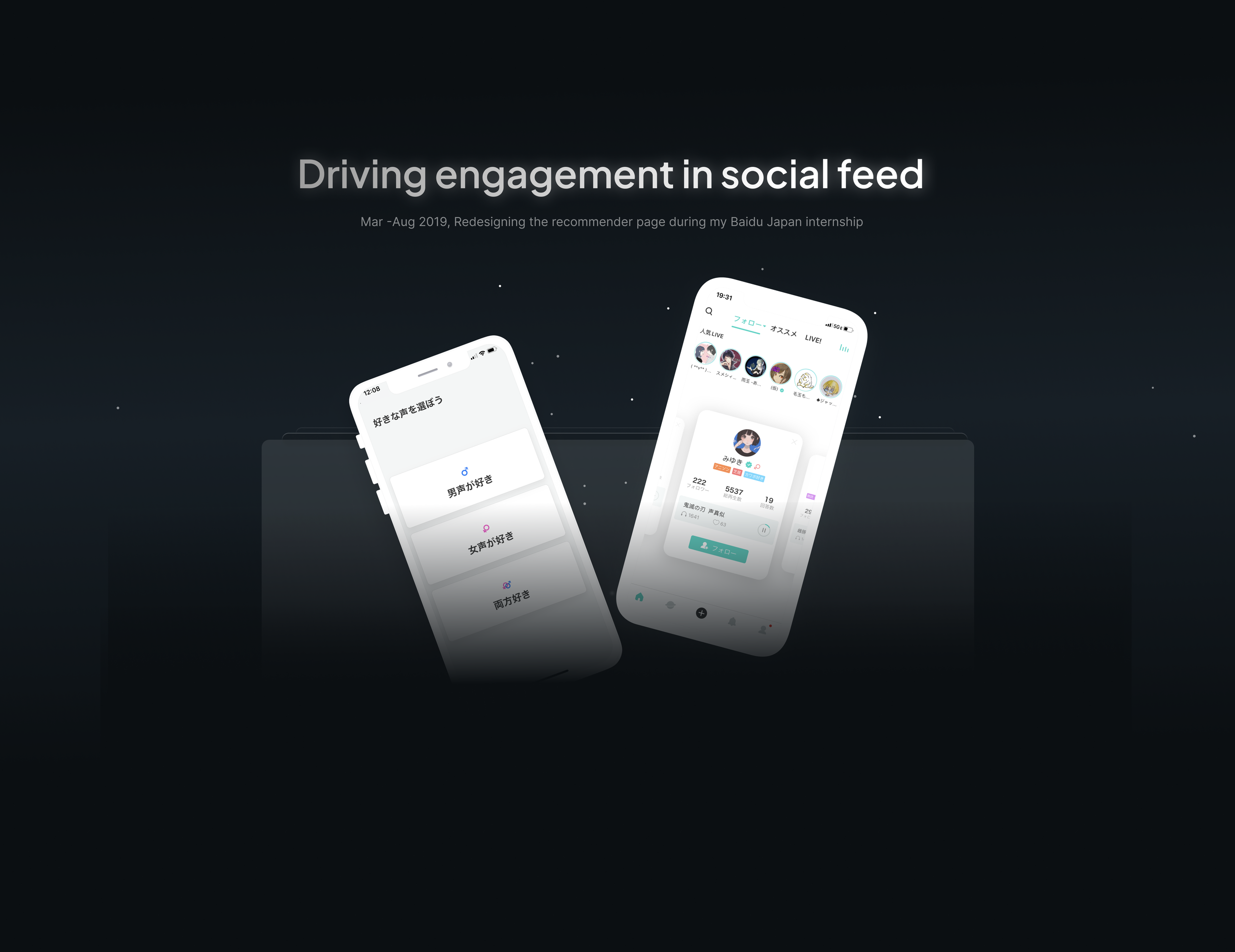
Baidu internship: Recommender Page Redesign
Intrigued users to explore more on the recommender page and achieved 300% growth in usage rate, 30% increase in usage time, and 6% growth in sign-up rate.
Outcome
300% growth in usage rate,
30% increase in usage time,
6% growth in sign-up rate.
MY ROLE
End-to-end Product Design Lead
STAKEHOLDERS
Product managers, developers,
researchers, senior designers, data analysts
TIMELINE
Mar - Aug 2019
Introduce LisPon
LisPon, a voice based social platform in Japan
Targeting at the ACG market in Japan, LisPon is a social platform to produce and share beautiful voices. Starting to cooperate with star hosts, LisPon is eager update its design to attract more users.
I had the chance to redesign its recommender page, which is the first page visitors see when they download LisPon. It is one of the most important entrances for visitors to understand LisPon and transfer them into users.
Design goal
Intrigue users to explore the recommender page actively


Design evaluation
Success in design metrics

Final design
Maximise users' interests on the recommender page


Design process
Lead the end-to-end working experience

Research process
1. Who are our main users on the recommender page?
Analyzing the data from our research team, I found it is hard to specify users needs on the recommender page. I then decided to conducted in-depth interview with 5+ current users and recorded ”how they used the LisPon" in three days to understand users behaviors more and then iterated the persona accordingly

2. What prevent users from exploring on the previous interface?
After building my basic understanding on main users, I communicated with the team to analyze the recommender page and figures out some problems that need to be improved. In order to understand more from users’ perspectives and verify my assumptions, I conducted contextual inquiries and think-aloud with 12 users and synthesized users’ words into my analysis.
01 Recommendations need to be curated for users

02 Information display: unclear hierarchy | de-emphasized voices | untracked info


Challenge
Users don't know what they want until you show it to them.
I realized that it is hard for them to imagine the expected state they want. Within the limitation of time and resources, I decided to change my research strategy and started by analyzing the successful precedents that did a good job in intriguing users to explore to understand:
"Why are users willing to explore on these successful precedents?”
"How can they inspire my design?"
3. How do successful precedents intrigue users to explore more?
I looked for examples of products that did a good job in intriguing and engaging users in and used competitive analysis to map out some elements that would be effective for designing “willingness on exploration” on the recommendation page. I bore the design and strategies they used in mind and pick those which could be adjusted into the LisPon. These examples included TikTok, Headspace and YouTube.


Ideation
Two main design directions
Bearing inspirations got from the research process in mind, I delved into the problem space to figure out “how to intrigue users to explore more on the recommender page?”. I brainstormed multiple ideas and combined them within different groups and finally figured out two main features of the redesign:
Voice-centered design: To present information, prioritizing voice interaction, the most important element, and increase information hierarchy can reduce cognitive load and increase willing to explore the page.
Filters & labels: pre-filter to target strong preference and a post-filter for quick and easy identification.

Prototype & iterations
Three rounds of iteration on voice-centered design
I developed the cards swiping scheme to display information and drew the first draft of redesign:
Voices will be played automatically on each card to attract users attention;
Users can interact with cards using the “heart” button when hearing voices they like.
Users can easily swipe cards to change hosts and their voices.

Iteration 01: Emphasizing call-to-action and enlarging personal information
I conducted 3 think-aloud testing with naive users. According to their confusion mentioned in think-aloud process, I emphasize the call-to-action in size as well as color to notify users what they can do on the page. Moreover, I enlarge the personal information section to build strong connection between hosts and their voices.

Iteration 02: Simplifying visual attractions to achieve voice attractions
After 2 more in-depth testings with users, I realized that they hardly noticed the choice list under call-to-action and confused about the profile images and the CD player. Combined suggestions from senior designers, I eliminated the visual design of the CD player and simplified the voice section to help users focus on voices.

Iteration 03: Eliminating information to accommodate the design into real world
I consulted the design with senior designers and project managers. Considering the length of Japanese sentences, I excluded the self-introduction because it was hard to show a complete sentence of self introduction on cards. I provided only one piece of voice per card to reduce the time users spent on each card before clicking on the call-to-action.

Two rounds of iteration on filter & labels
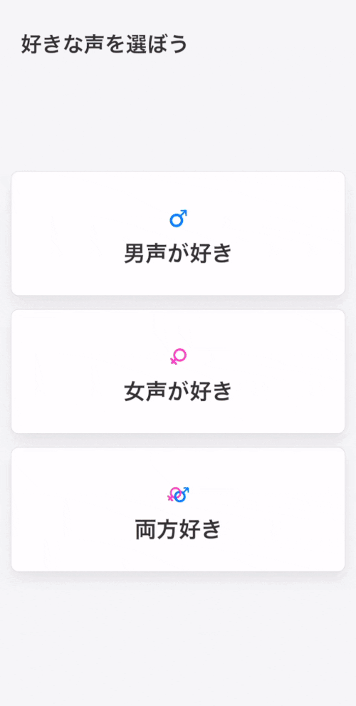
I designed a pre-survey before the recommender page according to the persona and insights from research process to catch users’ preference on genders as well as main types. When visiting the recommender page, I designed colorful labels to facilitate users easily and quickly filter more detailed types of voices when swiping back and forth.

Iteration 01: reduce the cognitive load on the survey
According to interviews with 5 new users, users found it took longer time with more choices in the survey. Some of them randomly chose some options without thinking too much on their interests. I realized it was kind of cognitive overload for users. I decided to segment the choices into two steps: gender and types. I also narrowed options in voice types to reduce the cognitive load on the page.

Iteration 02: colors of labels speak for themselves
In the iteration 01, I moved labels onto the left corner which were easier to be seen. However, it was not easy for users to leverage hosts with labels and got related information all at once. Interviewing with 5+ users, I realized that users didn’t remember the words in labels but colors on different labels. Colorful labels were able to draw users attention all at once. I then moved labels back under names of hosts in iteration 02 and users can still recognize types of voices through colors.

Final design
Match Interests
Before the recommendation page, users will choose their basic preferences: genders as well as types of voices.
On the recommendation page, users can quickly identify categories by viewing the colorful labels under hosts’ names on each card.
Voice-centered Design
The best sound of the host will be auto-played when swiping cards. Users can firstly differentiate hosts by listening to their sounds.
Each card only includes information on the voice and the basic information of the host to help users focus on voices.
“Add button” is more obvious on the page so that users have clear access to the next step — to follow the voice they like.

Reflection
Teamwork
In the whole design process, I realized that design is a teamwork. We need to balance requirements from various stakeholders and design within limitations. I discussed with product managers about new features, problems and goals; I consulted with the research team about their testing results and users’ feedback; I communicated with developers to balance their requirements… I also appreciated the chance to get valuable feedback from senior designers.
Design & business
Moreover, I find it interesting that design thoughts are connected intimately with thoughts in business, the area I worked for years. For example, the redesign task has “pay and gain” nature. Users pay their time/focus on one page to gain things that can bring them value or joy. The new way of presenting information is to optimize possible values or joy and reduce payment of focus. The filter feature reduces the payment of time to gain the value/ joy.
I enjoy the design process and enjoy thinking about the essence of better design. 💖